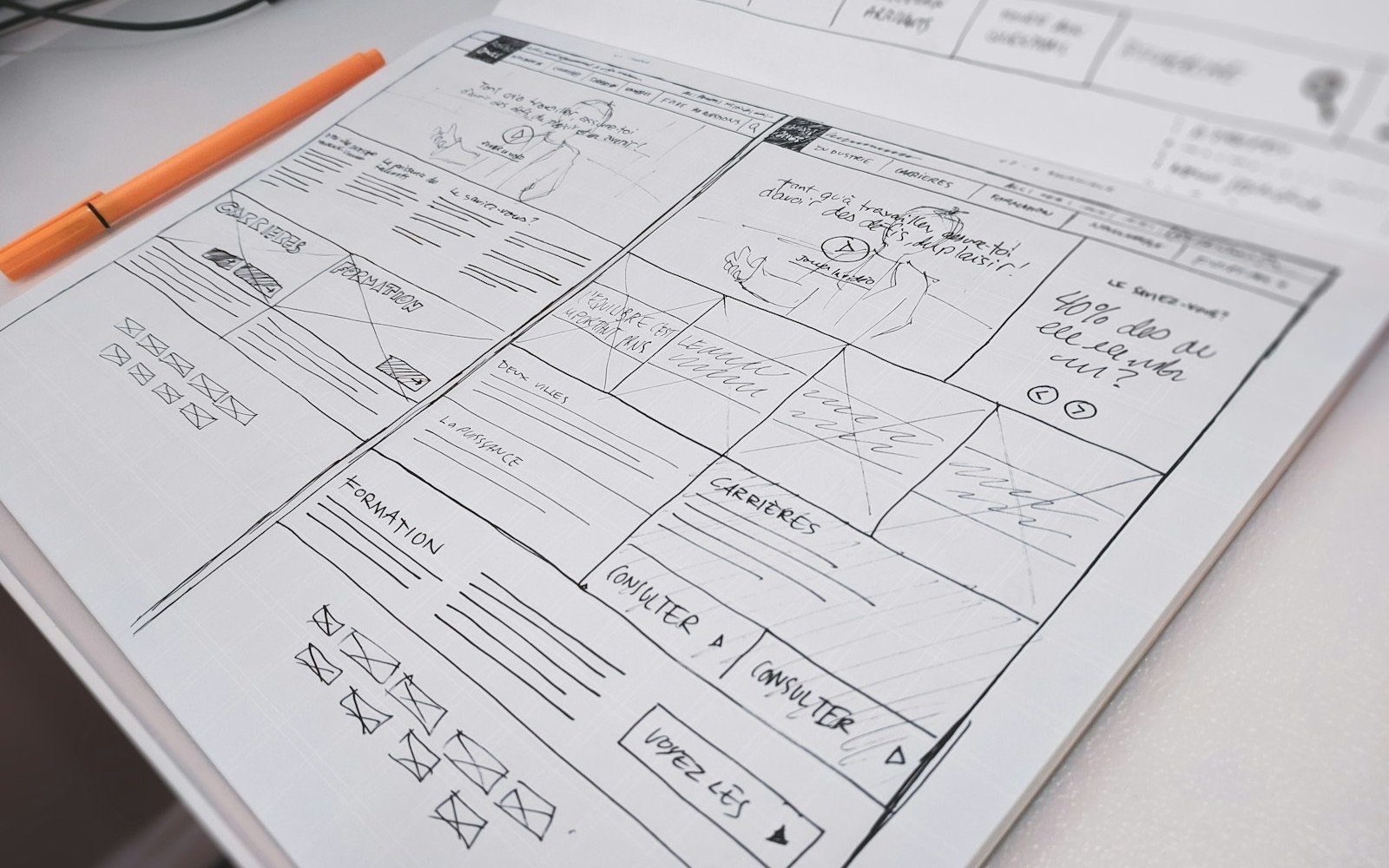
A landing page is a web page with a single goal and a single action: that whoever arrives does one thing, such as messaging you on WhatsApp, leaving their details, booking or buying. The difference from a website is that a website presents your whole business across several pages, while a landing page focuses on one offer and removes everything that distracts from it. In short: a landing page for a campaign, a website to be found.
What a landing page is and what it is for
It is the page where a person lands after clicking an ad, a message, a QR code or a link on social media. Since they arrive with a specific intent, the page talks about that and nothing else. It has no menu with ten options and no links to your story, your blog or your other services.
It serves three purposes: turning campaign traffic into contacts, presenting an offer or a dated launch, and measuring clearly what happened, because there is only one action to count.
What is better, a landing page or a website?
They solve different problems:
| Aspect | Landing page | Website |
|---|---|---|
| Goal | A single action | Present the whole business |
| Pages | One, read from top to bottom | Several: home, services, about, contact |
| Menu and links | None or minimal | Full menu to explore |
| Where people come from | Ads, QR codes, emails, social media | Google, social media, referrals |
| Lifespan | One campaign, launch or event | Years, with gradual changes |
| What you measure | How many take the action | Visits, page views, searches |
When a landing page makes sense and when a full website does
A landing page makes sense when:
- You pay for ads: you send each ad to a page that repeats its promise, instead of letting the visitor search your website.
- You are launching something: a product, a course, a promotion or an opening with a date.
- You have an event: a workshop, an open day or a talk with registration.
- You want to capture contacts: in exchange for a guide, a quote or an evaluation.
A full website makes sense when you offer several services, want to appear in Google searches, need to build trust with your story and contact details, or your customer compares options before deciding. If you only have a landing page and someone searches your business name, they will find little. If you do not have a website yet, start with how to create a website for your business. Landing page prices are in how much a landing page costs in Mexico.
What a landing page looks like: examples by business type
- Clinic or medical office: a page to book an evaluation for one specific treatment, for example orthodontics for adults. At the top, which treatment and for whom; then what the first visit is like, who sees patients and with what license, and a single button to book on WhatsApp with the message "I want to book my evaluation" already written.
- Auto repair shop: a page to quote one service, for example a tune-up or brakes. It shows what the service includes, how long it takes, the location on a map and a short form with the car make and model and a phone number.
- Course or workshop: a page to sign up for the next group. What the person will learn, the syllabus, the start date, who teaches it, opinions from past students if you have them and one sign-up button.
- Restaurant or cafe: a page to reserve a table for a special date or ask for an events menu. Your own photos of the place and the dishes, capacity, opening hours and a button to reserve on WhatsApp.
- Professional firm: a page for a first consultation on one specific topic, such as a procedure or a contract. What the consultation includes, how to book it and which documents to bring.
In all of them, the page answers three questions (what do you offer, why trust you and what do I do now) and asks for a single action.
How to make a landing page: what it needs
- A clear promise at the top. A headline that says what you offer and for whom, plus a supporting line. If it is not understood quickly, the person leaves. "Orthodontic evaluation for adults" says more than "Smiles that transform".
- Benefits, not lists of features. What the person gains: time, peace of mind, a concrete result you can actually deliver. A repair shop does not say "latest-generation scanner", it says "we tell you what is wrong before touching the car", if that is what you do.
- Real proof. Testimonials from customers who exist, photos of your work, your experience or your certifications. If you do not have testimonials yet, do not invent them: it is better to show your process, your facilities and real data.
- One call to action. One button, repeated on the page if it is long, that always says the same thing. With several buttons, the person does not know which one to tap and often taps none.
- A short form or a WhatsApp button. Ask only for what you need to reply. WhatsApp with a prefilled message removes friction for someone who already has the phone in hand.
- No distracting menu. With a menu, the person can leave for another page without taking the action you want. At most, keep the logo without a link.
- Speed on mobile. Many people open ads from a phone. Use light images and few heavy elements, and open the page on your own phone over mobile data before launching it.
- Privacy notice. If you ask for a name, phone number or email, Mexico's personal data protection law requires you to tell people how you will use the data (a privacy notice). Link your notice next to the form.
If you are about to launch a campaign, first decide where to advertise with Meta Ads or Google Ads for a local business, and if you will use Meta, read the Meta Ads guide for local businesses.
Common mistakes
- Several calls to action. One button to call, another for the form, another for the blog and another to follow you on social media. The person does not know which one to tap and often taps none.
- Sending ad traffic to the home page. The ad promised something specific and the home page talks about everything. The person does not find what they saw and leaves.
- A long form. Asking for address, company, budget and job title when you only need a name and a phone number.
- A promise different from the ad. The page headline should sound like what the ad said.
- Promising what you cannot deliver. Discounts that do not exist, assured results or invented testimonials damage trust and can bring legal trouble.
- Not checking it on a phone. Tiny buttons or cut-off text keep the person from tapping or reading what they need. Test it on your phone and on someone else's.
How to measure if it works
There is no universal "good" percentage: it depends on your industry, your offer and your ad. Compare each week against the previous one. What is worth recording:
- Visits that reach the page, by source (each ad or link with its own tag).
- How many people take the action: they submit the form or tap the WhatsApp button.
- How many of those contacts end in an appointment, a quote or a sale, which is what counts.
With those three figures you can run tests: change one thing at a time (the headline, the button, the length of the form) and compare one week against the next. With few visits, differences can be noise, so gather enough data before drawing conclusions. No page guarantees results: they depend on your offer, your price and how you respond to whoever writes.
At Elevalia
With our website service for businesses we help you decide whether you need a landing page for a campaign, a full website or both. We leave the page clear, fast on mobile and ready to measure.